CSS units are confusing AF 😖
I made a cheat sheet and a mini tutorial for those who get confused as well 😉


Welcome once again to my blog!
If you know anything about CSS, you probably know that CSS units are confusing AF...
em?? rem??😰
Can't we just use px?
ch????? What the HELL is this? 🤯

Today we're going to briefly learn about CSS units, since they're so freaking confusing!
In this blog post, I'll do my best to briefly explain each unit, and its best usage.
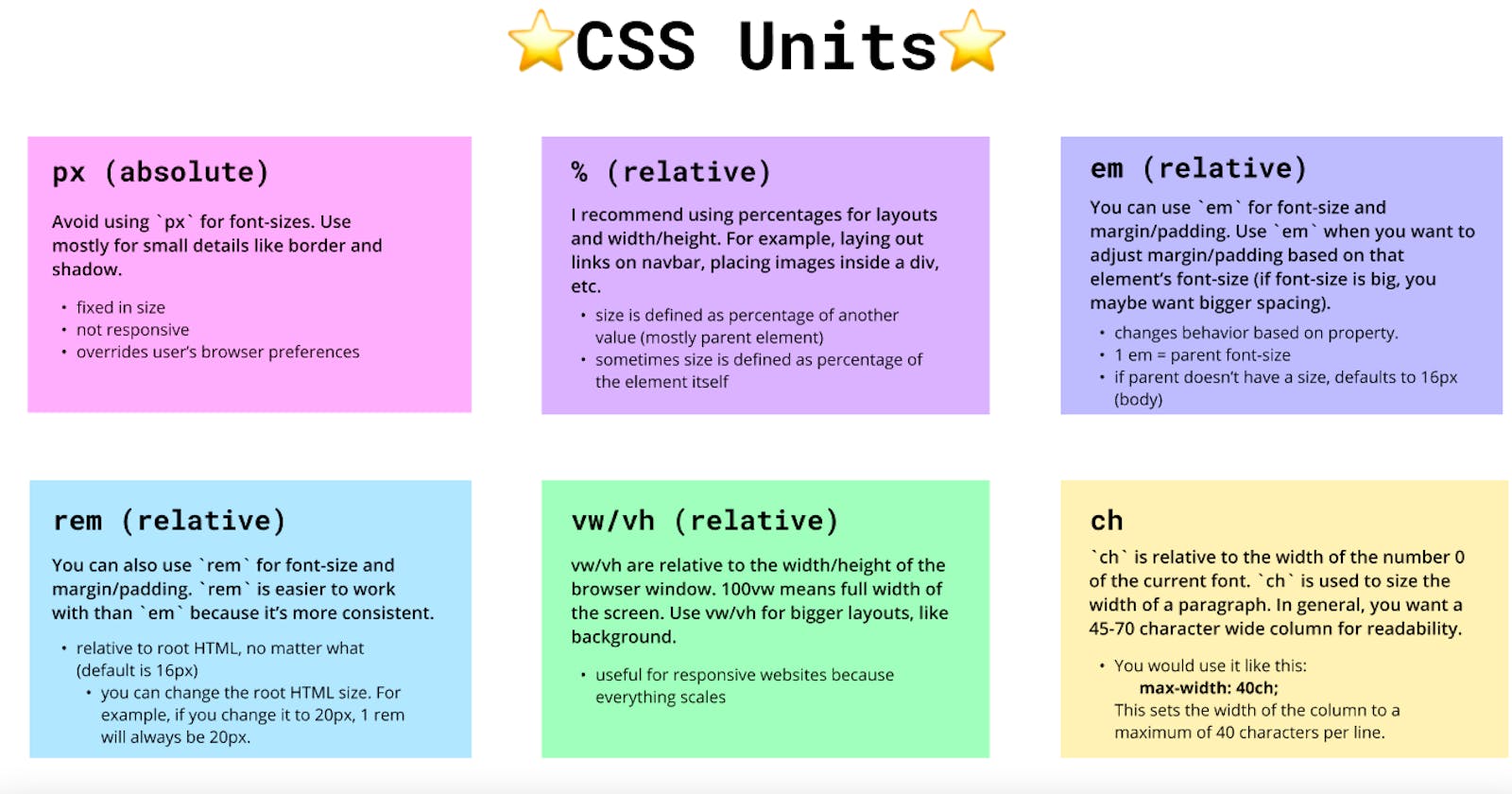
🐝 px (absolute)
Best usage: small details, for example, border size or shadow
Ah....yes. Everyone's first CSS unit 😆
We're all guilty of using px for every single thing at the beginning of our learning journeys...💀

Hopefully, now we know that px is probably not the best unit to use.
But we'll go over it pretty quick, since it's still very common.
🧐 What is px?
px is an absolute unit that stands for 'pixel'. This means that it's fixed in size. A px value remains unchanged, since it's not relative to anything.
1px is just 1px, and 96px is 1 inch (so you have a rough idea).
px is used in tutorials because it's quite easy to digest, unlike other CSS units. However, px is not the best unit you can use to size things, especially fonts and margin/padding.
Since px is fixed in size, it's not responsive, so (you guessed it), it's not an appropriate unit to create responsive websites.
🤔 What happens if you create a website using px?
px units don't scale, in other words, they override the user's browser preference.
For example, if a user has their browser settings set to 30px, you will override that setting by fixing your size to (for example) 15px. As a result, the user won't have a good experience on your site.
👌 When do I use px?
There are better units for things like font size, so I think that you should use px when you're setting the size of small details. For example, setting the width of your border or box shadow. Those things won't scale, they will mostly stay the same.
🌚 You don't have to know this:
But interesting fact, 1px does not equal to exactly 1 pixel on the screen. This is because now, we have higher resolution displays, so there's usually multiple pixels where there used to be only 1.
🐝 % (relative)
Best usage: mostly layout and widths, for example laying out navbar links, or placing/grouping images inside a div
🧐 What is %?
% is a relative unit that is used to create responsive websites. A size defined by % is a percentage of another element, usually the parent element. However, if the parent's size is not defined, the size will be defined as the percentage of the body.
.child {
width: 50%; //50% of parent
}
In here, suppose that this element is nested inside a div. This means that the div is the parent element. As a result, the width of .child will be 50% of the parent div.
There are other occasions in which % isn't relative to its parent element.
Sometimes, % defines size as a percentage of the element itself.
For example, take a look at the line-height property below:
.child {
font-size: 80px;
line-height: 50%; //40px
}
I know we agreed not to use px for font size, but it's for the sake of the example. Bare with me😅
Here, the line height will be 50% of the font size, meaning line-height will have a height of 40px. line-height is taking the percentage from it's own element, the .child class, not its parent.
The main takeaway is that the size defined by % really depends on the property.
👌 When do I use %?
Personally, I would use % when I'm defining smaller layouts, such as displaying links on a navbar, or equally placing images inside a div.
🐝 em (relative)
Best usage: font size (depends), margin/padding
Now...the two most confusing elements in my opinion...😰

It's OK....I'll try make it understandable...
🧐 What is em?
em is also a relative unit that is used to create responsive websites. However, it's a bit tricky to use, as its size depends on the parent element. For example, 1em is the parent's font size, 2em is double the parent's font size, 3em is triple the parent's font size, and so on.
Problems arise with em when it's used in situations, such as, font sizes in nested lists. This is because, in situations like this, em will keep inheriting its parent's new size.
For example, imagine you created a list in your HTML document, and you're writing CSS for all of your <li> elements.
.parent-div {
font-size: 10px;
}

.list-item {
font-size: 2em;
}
Here, the .list-item class will double its parent element's font size. So, this code will make the first <li> element inside the .parent-div have a size of 20px. Then, it'll make the next nested <li> be 40px. This is because now, the first <li> element is the parent of the nested <li>.
As you can see, you must be careful and well aware of what you're doing when you use the em unit.
👌 When do I use em?
I would use em on font sizes and margin/padding. em seems pretty scary, but it can be useful when you want spacing (padding) to get bigger or smaller, depending on the font size. In other words, the padding will grow and adjust to its font size.
One instance is when you're specifying space around headings or a button. You want the space around the content of a button to match its font size.
🐝 rem (relative)
Best usage: mostly font size, margin/padding
🧐 What is rem?
rem is yet another relative unit that facilitates creating responsive websites. rem was created to fix the problem em had.
Unlike em, rem is relative to the root HTML document, which is by default, always 16px. In other words, 1rem is 16px, 2rem is 32px, and so on. As a result, rem is generally easier to work with because it's more consistent. It's a really good alternative to use to specify font sizes.
You can change the root HTML document's default size. It doesn't always have to be 16px. You can change it to any number you like, and that will be the new value of rem.
For example, let's take a look at the code below:
html {
font-size: 10px;
}

p {
font-size: 1.5rem;
}
Here, we've set the HTML default size to 10px. So, 1.5rem is 15px. 2rem will be 20px instead of default 32px.
👌 When do I use rem?
I always use rem with font sizes. It's consistent, but responsive at the same time. Also, you don't have to calculate how many pixels each rem is, you just have to remember that 1rem is 16px.
🐝 vw and vh (relative)
Best usage: bigger layouts, such as background
🧐 What is vw and vh?
vw and vh are units that are relative to the width and height of the viewport. In other words, it's relative to the browser window (the screen, basically).
For instance, 100vh is 100% the height of the browser window. Basically, it'll take full height of the screen. It's pretty much the same thing with vw.
👌 When do I use vw or vh?
I recommend to use vw and vh when you're dealing with bigger layouts, such as backgrounds.
🐝 ch
Best usage: to change the width of a paragraph
🧐 What the hell is ch?

I think that ch is one of the less commonly used CSS units. I didn't know about it for the longest time as well, but it can be very useful!
You probably know that typography is one of the core elements of designing a webpage. I don't know much about design😅 ...but all I know is that paragraphs with shorter widths are generally easier to read.
So, ch uses the width of the number 0 of the current font. ch is used to give the paragraph a maximum width. In other words, it limits the width of the paragraph so that a specified number of characters are on each line.
The cut-off line for this is mostly 45-70~ish characters per line.
This is how you would use ch:
p {
max-width: 45ch;
}
The code above is basically saying that for paragraph p, we want the width of the column to be 45 characters long.
That's it!
You probably look like this by now 🤣

But thanks for making it this far, and hopefully you now have a better understanding of CSS units😆
I've posted the cheat sheet on Twitter!